

Running a roofing business means constantly asking questions.
- Why is revenue up or down this month?
- Which marketing channels actually bring the best leads?
- How is my team performing?
- Why are we losing jobs?
Historically, answering these questions meant exporting data or piecing together reports across multiple tools.
Roofr’s Performance Dashboards bring those insights directly into the platform, giving owners and managers a clearer view of performance across jobs, leads, teams, and lost opportunities.
Instead of manually building reports, you can quickly understand what’s happening in your business and where to focus next.
The Four Performance Dashboards
The reporting experience is organized into four dashboards, each designed to answer a different type of business question.
Job Reports -> Pipeline health and revenue trends
Lead Performance -> Lead sources and marketing effectiveness
Team Performance -> Individual team member performance
Jobs Lost -> Why deals are lost and where revenue is missed
Each dashboard highlights different parts of your business so you can quickly identify trends, opportunities, and areas that need attention.
Job Reports
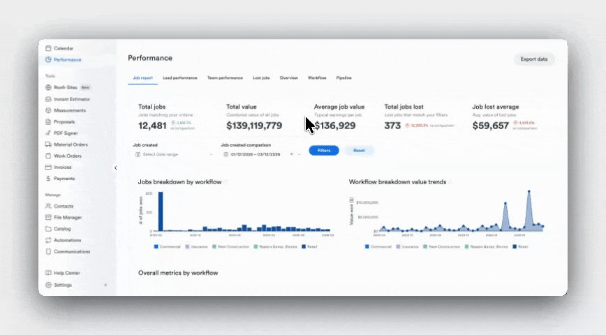
Understanding Pipeline and Revenue Performance
The Job Report helps you understand how jobs move through your pipeline and how that activity impacts revenue.
Why is my revenue down this month?
Start in the Job Report, where the top KPI metrics and workflow trend charts show changes in your total pipeline value.
Reviewing these trends helps you identify whether revenue changes are caused by:
- fewer jobs entering the pipeline
- lower win rates within a workflow
- deals slowing down during follow-up
Understanding where the shift begins helps teams focus on the part of the pipeline that needs attention.
Which workflows generate the best results?
In the workflow performance table, you can compare results across different workflows.
This section highlights metrics like jobs won, jobs lost, and win rate, helping you see:
- which workflows consistently produce the strongest results
- where conversion rates are highest
- where opportunities may be getting stuck.
These insights help teams focus their efforts on the processes that drive the best outcomes.
How much pipeline value am I losing?
The Job Report also surfaces lost opportunity across the pipeline.
Metrics like total jobs lost and average lost job value help quantify how much revenue may be slipping through the pipeline.
By identifying where losses occur most often, teams can focus on improving conversion in the areas that have the biggest financial impact.
Lead Performance
Understanding Marketing and Lead Quality
The Lead Performance Dashboard connects marketing activity to real business outcomes.
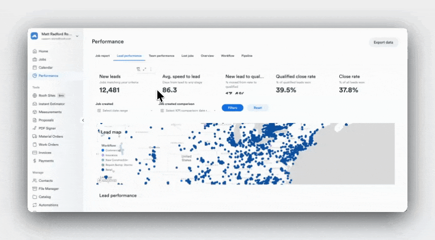
Which marketing channels bring the best leads?
Open the Lead Performance table, where you can compare results across lead sources such as referrals, paid ads, and website leads.
By reviewing metrics like:
- total won value
- jobs won
- average job value by source,
you can identify which channels generate the most meaningful revenue, not just the most leads.
Where are my leads coming from geographically?
The lead map visualizes where leads originate across different regions.
This helps contractors understand:
- where demand is strongest
- whether leads are coming from outside their service area
- where future growth opportunities may exist.
Seeing geographic patterns can help refine marketing targeting or identify areas where expanding service coverage may make sense.
Are my leads converting efficiently?
The dashboard also highlights funnel conversion metrics, which help evaluate the health of your lead pipeline.
Key indicators include:
- lead qualification rate
- close rate
- qualified close rate
- speed to lead
Reviewing these metrics helps identify where improvements may be needed.
For example:
- slower response times can reduce conversion
- lower qualified close rates may indicate sales process challenges
- high lead volume with low wins may signal lower lead quality.
Team Performance
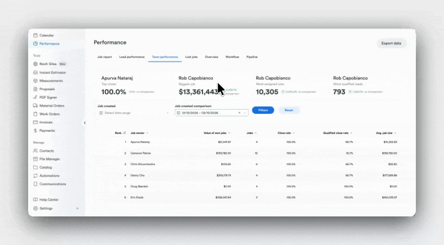
Understanding Sales Performance Across Your Team
The Team Performance Dashboard provides visibility into how individual team members are performing.
Who is my top performer?
The team ranking table highlights performance across metrics such as:
- value of won jobs
- close rate
- job volume.
This helps leaders identify different performance patterns across the team, such as reps closing the highest value deals versus those managing the largest number of opportunities.
Who might benefit from coaching?
By reviewing close rate and qualified close rate across team members, managers can identify potential coaching opportunities.
For example, a team member handling many jobs but closing fewer opportunities may benefit from additional support or process improvements.
These insights help leaders identify where training or adjustments could improve overall team performance.
Is work distributed evenly across the team?
The dashboard also highlights job assignments across team members.
Comparing job counts across the team can help identify whether workloads are balanced or if certain team members may be overloaded.
Balancing assignments more evenly can often improve both conversion and pipeline health.
Jobs Lost
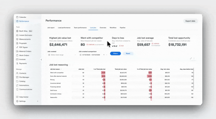
Understanding Why Opportunities Are Missed
The Jobs Lost Dashboard helps teams understand why deals are not converting.
Why am I losing jobs?
Start with the loss reason breakdown table, which categorizes the most common reasons deals are lost.
Common examples include:
- ghosted
- went with competitor
- pricing
- timing
Seeing these patterns helps teams identify the underlying issues affecting conversion.
For example, if ghosting is the most common reason, improving follow-up processes may have a larger impact than adjusting pricing.
Am I losing on price or something else?
The dashboard compares the number of jobs lost with the value of those losses.
This perspective helps determine whether pricing is truly the biggest issue or whether other factors are responsible for larger revenue losses.
Sometimes a smaller number of lost jobs can represent a much larger share of lost revenue.
How much revenue am I leaving on the table?
The top metrics in the dashboard highlight the financial impact of missed opportunities, including:
- total lost opportunity value
- highest value job lost
- average value of lost jobs.
Understanding the scale of lost opportunity helps teams identify where improving conversion could recover meaningful revenue.
Connecting the Dashboards
While each dashboard answers a different question, the real value comes from using them together.
For example, when evaluating marketing performance:
- Start in Lead Performance to understand where leads originate
- Review Job Reports to see how those leads convert into pipeline value
- Use Jobs Lost to understand why some of those opportunities were lost
This connected view helps teams understand the full path from lead → pipeline → revenue, making it easier to identify where improvements will have the greatest impact.
How Often Should You Review These Dashboards?
Each dashboard supports different types of performance checks depending on how frequently you review your business.
Daily
Monitor new leads, pipeline activity, and deal progress.
Weekly
Review trends across workflows, team performance, and lead sources.
Monthly
Evaluate revenue trends, marketing effectiveness, and patterns in lost opportunities.
Building a consistent reporting habit helps owners and managers identify issues earlier and make better decisions about where to focus next.
A Clearer View of Your Business
Roofr’s Performance Dashboards help contractors understand how their business is performing across revenue, leads, teams, and lost opportunities.
By bringing these insights directly into the platform, owners and managers can move beyond manual reporting and quickly answer the questions that matter most when running a roofing business.
With the right insights in one place, it becomes easier to identify opportunities, improve conversion, and grow your business with confidence.
View the dashboard live now or speak to an account manager to learn more.
